Check the background of this firm on
Assets in money market funds have climbed to nearly $5.6 trillion dollars. That is an all-time record. It is also an 18% increase since January 1st.
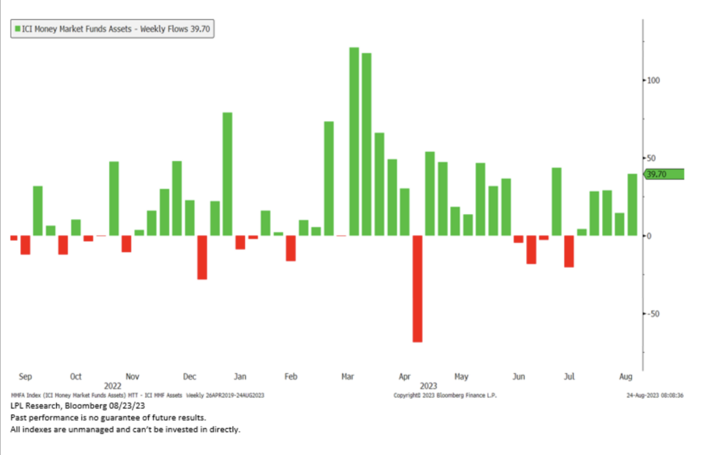
Take a look at the chart above from LPL Financial. It shows the weekly inflows and outflows to and from money market funds over the past year. There’s a lot more green than red on this chart. More specifically, money market funds have captured inflows in 24 of the past 33 weeks, and 5 weeks in a row.
Money Market funds invest in short-term, high-quality debt or cash equivalents and are intended to provide investors with low-risk income and stable liquidity, but they are not completely risk-free and are not FDIC insured.
That being said, investors clearly are loving the attractive yields they are paying, in many cases, more than 5%. That’s significantly higher than most bank savings accounts. It also comes with less volatility than the stock market.
Our friends at LPL Research point out that the inflows to money market funds were also spurred on by the turmoil in regional banks this spring. You can certainly see that in this chart.
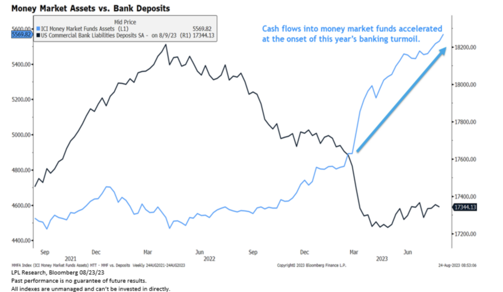
The black line represents bank deposits and the blue line represents inflows to money market funds. You can see a surge during the spring months. Some of these flows could be attributed to declining confidence in the banking system.
But there is also historical data that suggests investors flock to money market funds when rates go up, and flood out of them when rates go down, but not until they usually are close to hitting rock bottom.
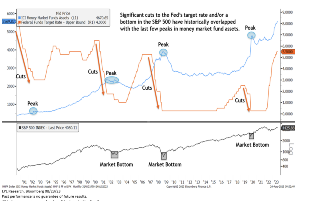
Our final LPL chart is busy one. This chart tracks three things. The orange line is the Fed funds target interest rate. The blue line represents flows into money market funds, and the black line is the S&P 500 going back to 1991. Look at the arrows on the orange line. Inflows to money market funds usually peak about the time the rate hiking cycle ends, not begins. The peak also seems to coincide with a market bottom.
It’s an interesting study on investor behavior. But, it’s not an endorsement of trying to time the market. The reality is that these lines are covering long lengths of time and it is unlikely that any investor moves completely out of the market at the peak, and back into the market at the exact bottom. We’ve shown you plenty of charts in this segment that prove that that doesn’t happen.
What is true, is that when interest rates rise, it is more appealing to take advantage of getting paid more for less risk. And, for short-term financial goals, or for money you plan to use in the near future, we would agree that removing volatility from those funds is the right idea.
But, don’t get overzealous and move out of the market with your long term investments. Stick to your plan. And if you don’t have one, its time to get one, by working with a financial advisor.